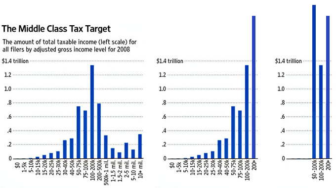
So it started with a graph. Which was followed by a rebuttal and a follow up graphic.
The claim? Well, rich people are actually a single category of wage earner and “rich” starts at (according to Jonathan Chait) $200K. So any chart that breaks down income in increments larger than $200K is faulty.
If it makes sense to lump all “rich” people into one category, it hardly seems fair to break down all other income levels. So let’s see how income is truly distributed if all income earners at $100K and below are lumped together:
Sweet, turns out the “poor” have more money than the “rich” after all.
Maybe we should stick to data in the first place?
